MONO design agency set out to work with University of Wisconsin - Stout students on an opportunity to add a unique project to their portfolios. The task at hand was to redesign the Sherwin Williams HGTV home paint can collection so that it stands out on the shelves at Lowe stores across the country. Throughout this process, we worked with head designers to research and design a package up to the task and presented our new design in front of our fellow students and designers at Mono Agency.
Mood Board + Concept
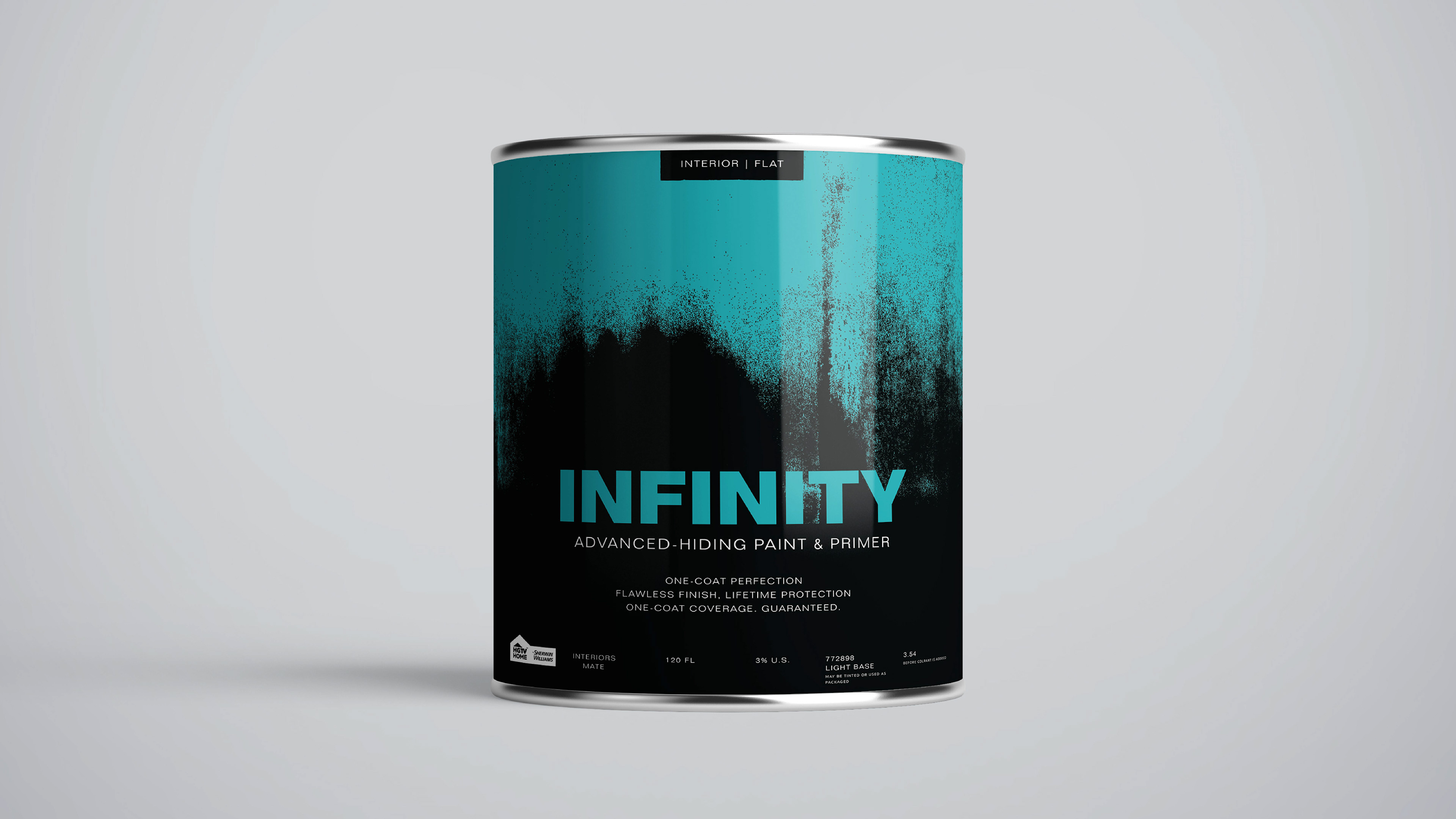
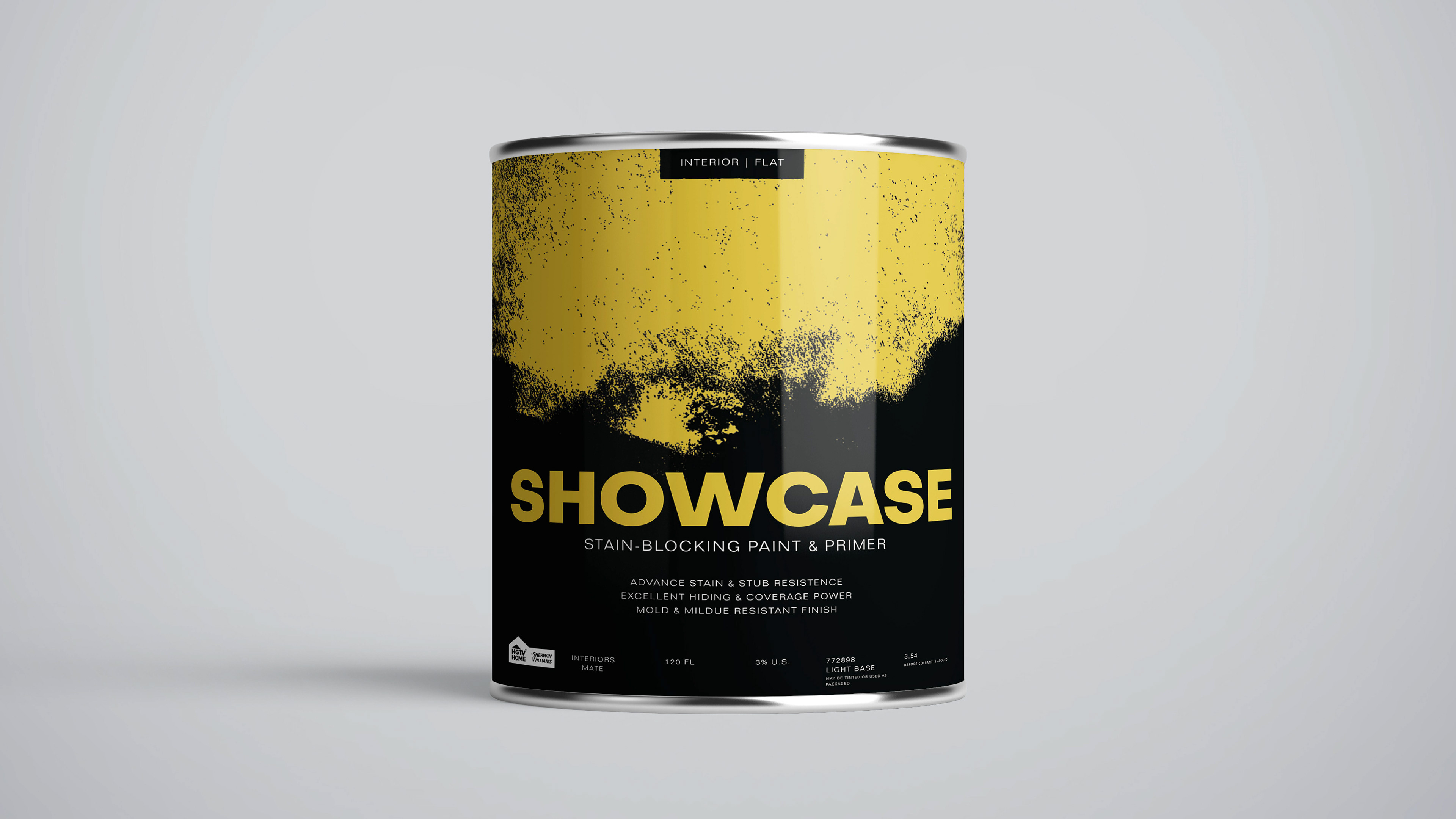
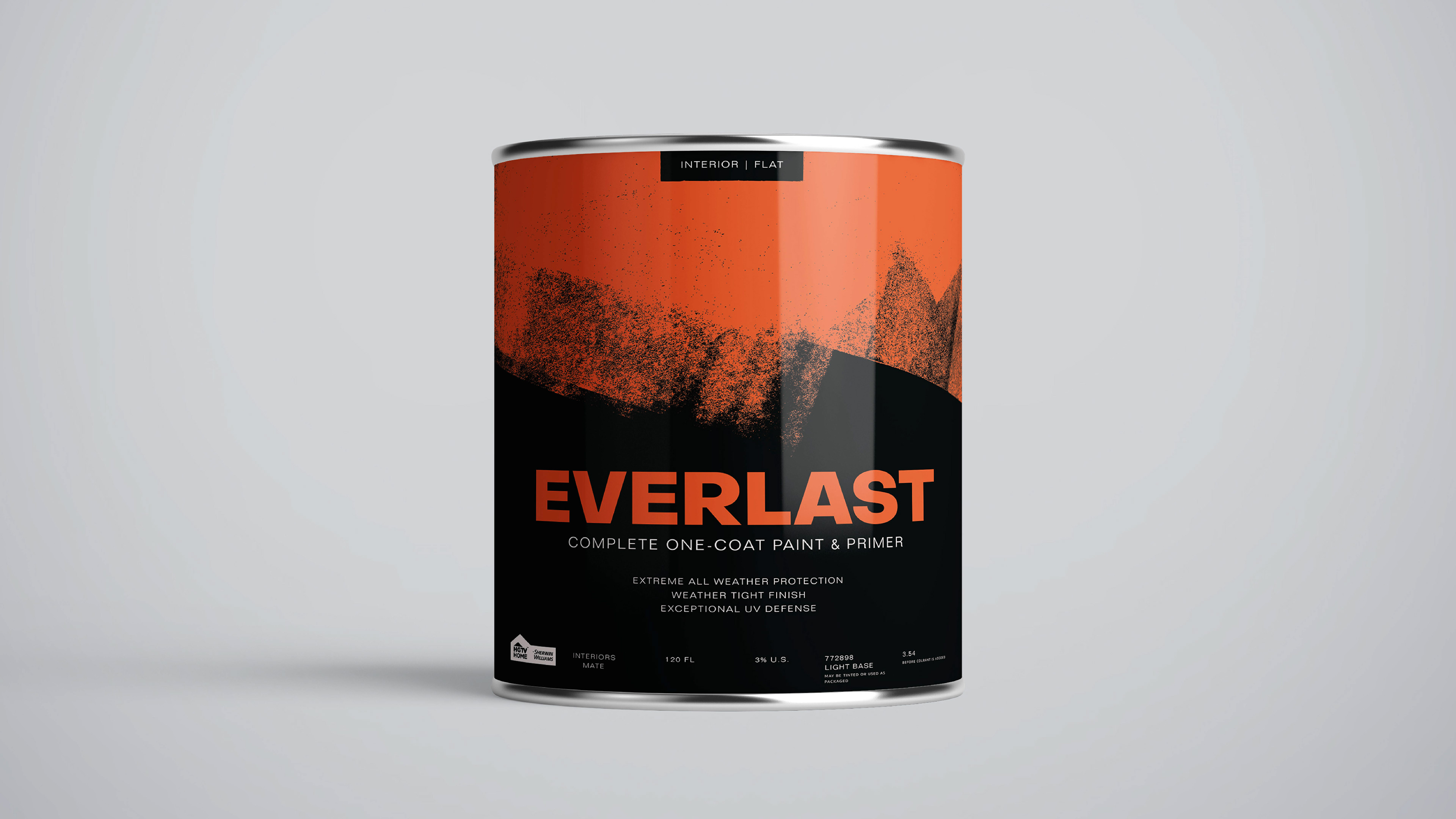
My main concept focuses on BOLD movements. When reimaging a space you have to make that decision of what color you’re going to use. Choices and changes You’re going to make to create the space you want to surround yourself with. These are the bold choices we make when deciding to reimagine and create a new space. The movement focuses on the way certain tools that are used to paint a wall are used and what the first initial contact between the wall and you looks like. These marks are what you can imagine yourself doing. They are the first strokes to your new space. The whole concept revolves around a social movement of DIY mentality and being able to make those decisions for yourself by yourself and being able to see that every step of the way.

Explore Concept
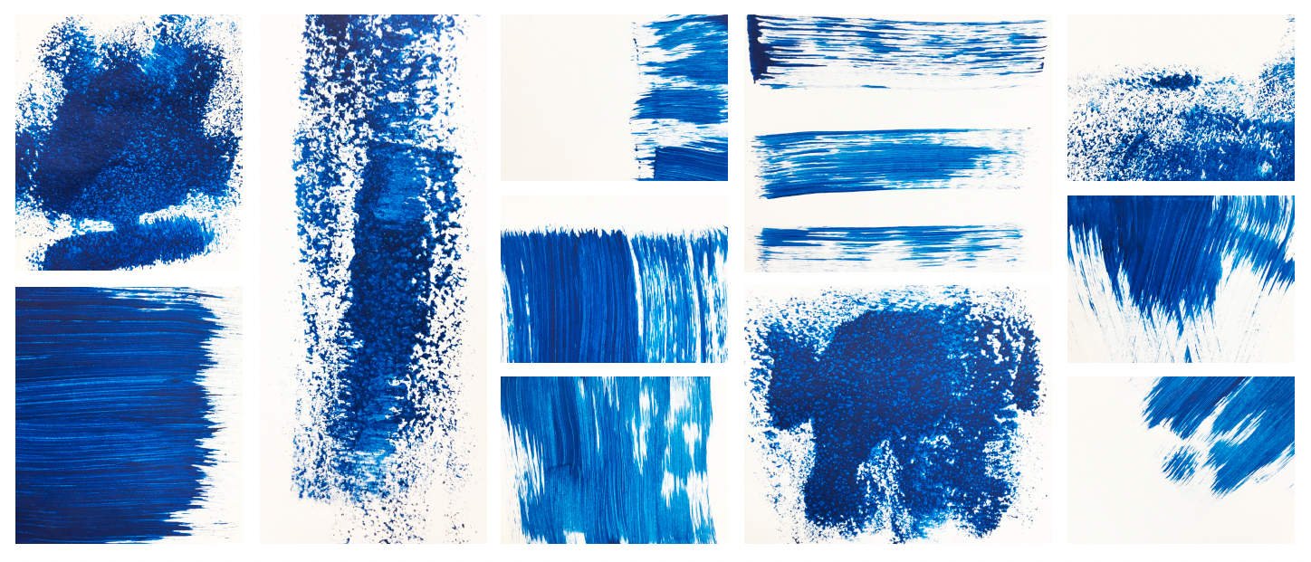
After thinking about my concept I reevaluated the way I approached my mark-making. Instead of using painting brushes, I opted for a paint roller, sponge wedges and a wide bristle brush which are all tools that are used to paint walls. I wanted to get at this concept of it being the first initial moment you start your wall painting journey. Those first marks that you make when you decide to act on your decision to Redesign your space. When creating these marks I decided to focus on how the paint flowed against the material.

Color Choice
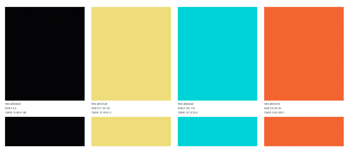
When researching how other paint brands used color for their packaging I noticed that there were a lot of brands that follow the same pattern. The colors were either used in gradients or in design elements that create smooth transitions and are usually placed on a white background. Or they are cans with the one chosen color covering the can. In our competitive skew brands like Jolie Home, The Spruce, and Backdrop all have white backgrounds and Benjamin Moore and Behr Marquee have a single color background with an added gradient on it. I wanted to go against that and create this juxtaposition & contrast that would be noticed on a shelf if it was placed next to a competitor.
Type Choice
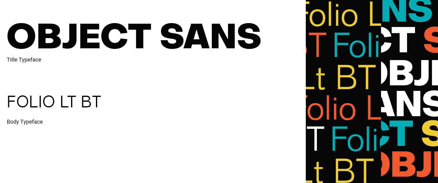
For the paint can title I decided to use the typeface Object Sans. The idea is to create this authentic, straightforward approach to the design and I felt that this typeface had more structure and was easily legible because of how bold and evenly partitioned the letters are. It fits with the Bold theme that I was going for. It stands out but also has a character to it. It’s not just all straight lines there’s some curvature to it with gave it depth. I decided to use the typeface Folio specifically Folio Lt BT as the body type because even though they are both sans serif. There is enough of a shift in the way the characters Are shaped to notice a difference. This goes with the idea of juxtaposition and boldness that fit my concept.
Final product design for the Sherwin Williams paint cans